

So far, when discussing loads, we have accentuated the positive – low loads, optimum loads, reliability reserves and staying on the good side of the tipping point. Now we must climb down into the deep hole of over-load.
It is dark down here and lose-lose. On over-loaded roads speeds fall and throughput falls. To recap, when the road in Singapore is in flow, 20km/h faster (~65km/h) than the tipping point, throughput has climbed to 2,000. When the road is spluttering 20km/h slower than the tipping point (~25km/h), throughput has fallen to 2,000. From there as the load increases, speeds fall further, and throughput falls further until the road reaches gridlock – a useful colloquial description of a road in full over-load melt down.
Trains also fall into the over-load hole. TNSW said that over-load caused delays but did not say by how much. We can expect that there will be a scale of severity, the more the train is over-loaded and the longer the over-load lasts, the greater the delays. It was during over-load that in recent years the Melbourne train operator started skipping stations or U-turning the service before its destination so that the timetable could be met at least in part. This helped the operator meet contractual obligations but meant passengers were no longer delayed, they were prevented from completing their journey. Gridlock for train passengers.
Transport for London’s pedestrian over-load measures have 2 levels of over-load. Above 18 people a minute per metre, people collide, and bi-directional movement becomes difficult. At 35 ppmm, extreme difficulty is experienced moving in reverse flow. Gridlock for people on foot.
A common scale
A colloquial description like gridlock the severest over-load is useful in conversation but for our roads (and other loads) we also need a more formal scale that allows us to understand and compare the severity in one location across the day and compare one location with another.
We have a choice of a relative or absolute scale. Absolute scales like Charles Richter’s scale for earthquakes or Commander Beaufort’s scale for winds are familiar and widely used. But we have seen that tipping points vary widely (~65m/h in Washington and ~47km/h in Singapore). So, our scientific scale of badness must be a relative one like a ladder dangled down the well secured at the top to the measured tipping point.
The rungs of our ladder could be proportions – 20% below, 30% below and so on. Since we are using bands on the good side of the tipping point, we could set up bands on the downside and give them names such as Level 1 (65% - 50% below), Level 2 (40% - 30%), Level 3 (30% - 20%), then Gridlock when everything stops.
In the best of all possible worlds, we would now refer to a list of Australian roads with their tipping points. But this list has not revealed itself, demonstrating we live in a less perfect world where congestion pricing is not yet part of everyday life.
Second best is a list of observed speeds from Austroads which we can match with the local speed limit. This will give us a sense of what a severity table would be like.
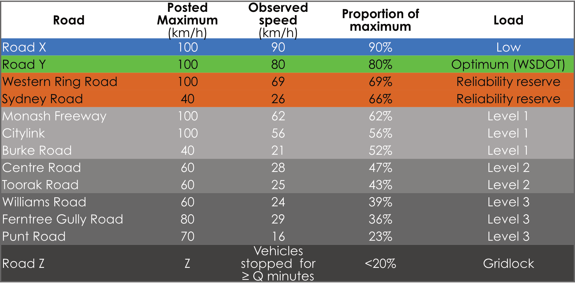
This mock-up table reveals several of the features we would find on a real league table based on tipping point speeds:
The slowest roads are not always the roads that are most over-loaded. Speeds do not get above 28 km/h on Centre and Toorak Roads, but the roads are only in Level 2 congestion.
Roads that are running faster, may still be heavily over-loaded. Ferntree Gully Road is operating at a 29 km/h but is in Level 3 over-load.
Two roads with similar observed speeds may have different levels of over-load. Although the observed speeds are similar (24 - 26km/h), over-load is less of a problem on Sydney Road (reliability reserve) than on Williams Road (Level 3).
Problems with the mock-up table
Of course, the above table of Melbourne road-loads is a fake and only of value as an illustration.
First, the speed data in the Austroads report has been averaged across 24 hours, an approach which hides the peaks and troughs across the day. Even Punt Road, with its very low batting average, is probably at some times in flow. Austroads recognises this weakness when it reports that in cities like Melbourne and Sydney average speeds fall in the morning peak periods starting 05:00 – 06:00 and in afternoon peaks between 15:00 – 21:00.
Second, in the data the days have been anonymised to protect their identity. In real life, loads vary across the days of the week. Austroads report that the weekend load on Paramatta Road, Sydney is half that of weekdays.
The third way the mock-up table is inaccurate (and this is nothing to do with Austroads) is that the Levels are based on an unsound datum – the posted speed limit instead of the tipping point speed. Maximum speed limits do not have any mathematical connection to the tipping point.
Finally, the illustrative table does not report throughput. This information is need for comparisons. We should care less about a low throughput road that has fallen down the well to Level 3, and care more about a high-throughput road such as the Western Ring Road that is slipping into over-load.
Reporting the load
Nonetheless, the fake table gives you an idea of the sort of league table of major roads that is necessary to inform education and discussion about a pricing method that will reduce or prevent congestion (over-load).
Such tables should be prepared regularly and frequently using real-time data (not modelling or sampling) and published on the Internet in a manner like that used by NSW Trains. The data visualisation would come with adjustable filters so people can see how loads vary by time of day and day of week and be able to identify roads that promise the greatest return in throughput from load-based pricing.
Furthermore, if we want people to understand and support a charge, these reports must become familiar, trusted, and understood well before a specific charge is proposed. This is the approach taken in other domains such as public health, education or with economic data, where the supporting information arrives well before any legislative countermeasures.
It is not only public understanding that can be built on a base of fresh, regular, real-time data. The data can also be used by those working up policy responses.
We will talk more about policy development in the next section but here we will provide one example, to illustrate the need for a common evidence base. In 2015, Austroads said that roads are stressed in the PM between 15:00 – 21:00. In its 2019 proposal the Grattan Institute recommends a congestion charge in the PM between 15:00 – 18:30, Which should it be? And have things changed since the pandemic?
As Mr Deeming said: in God we trust. All others must bring data.